Infinite canvas
An infinite canvas sounds appealing, but there's a reason the page model is so widely used in productivity tools. Read on to learn why, and how you can help test an infinite canvas for Muse.
When using Muse in portrait mode, you might wonder: what’s the deal with that black bar?
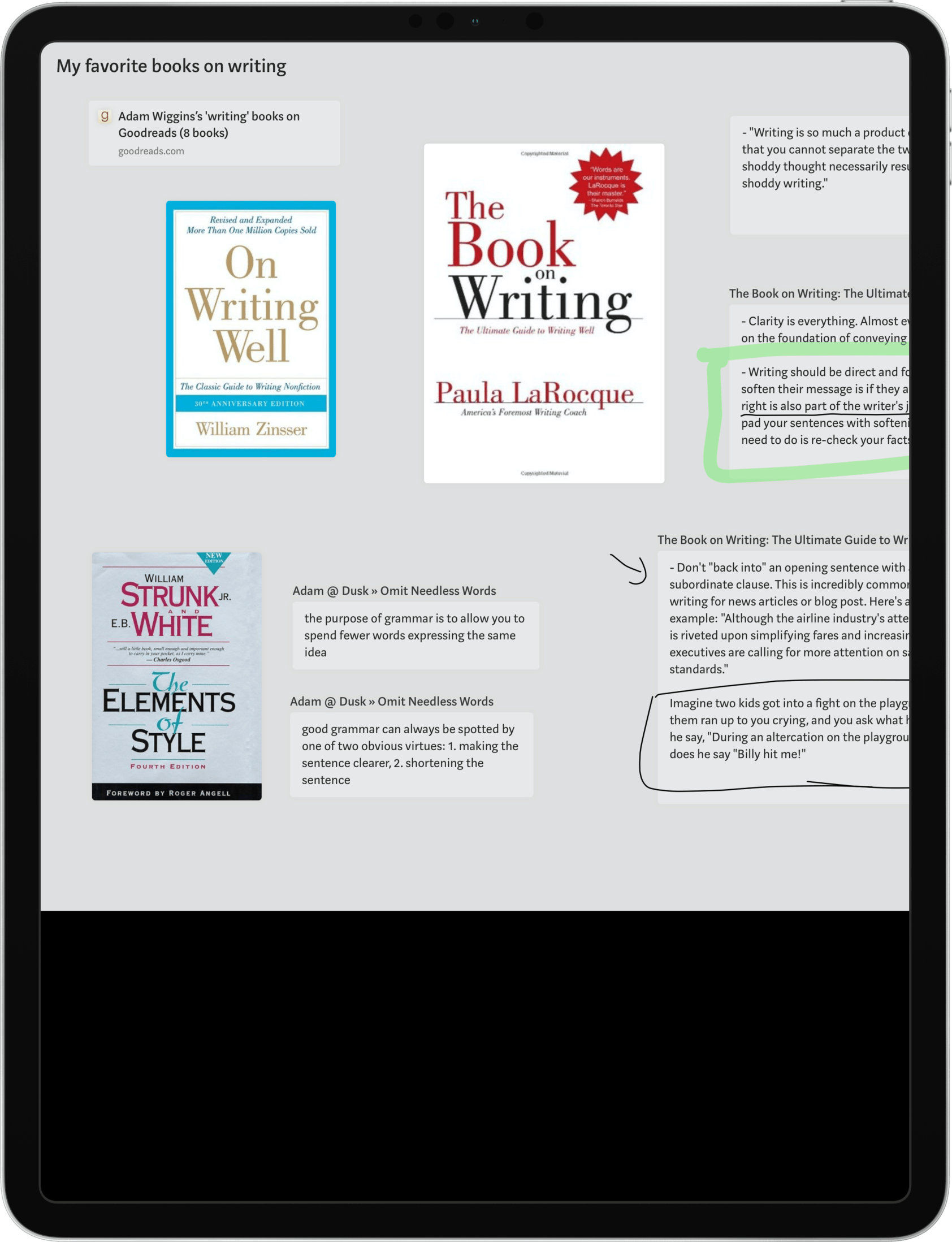
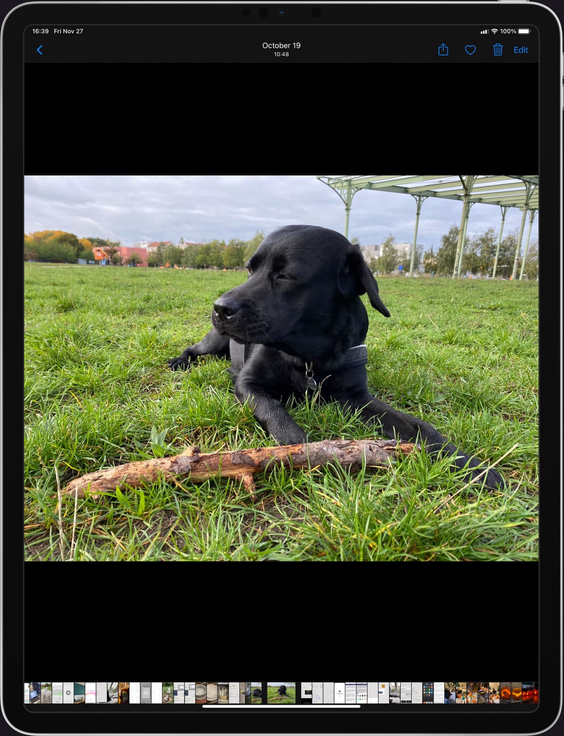
The dead space is because Muse currently uses a page-based visual model. Boards are created in landscape orientation by default. The black bar you see here is the same as viewing a landscape-orientation photo on your iPad in portrait orientation, which places black bars above and below.
This puts Muse in good company: most productivity apps including presentation software like Keynote or Pitch, word processors like Google Docs, and digital sketchbooks like Paper use a page model.
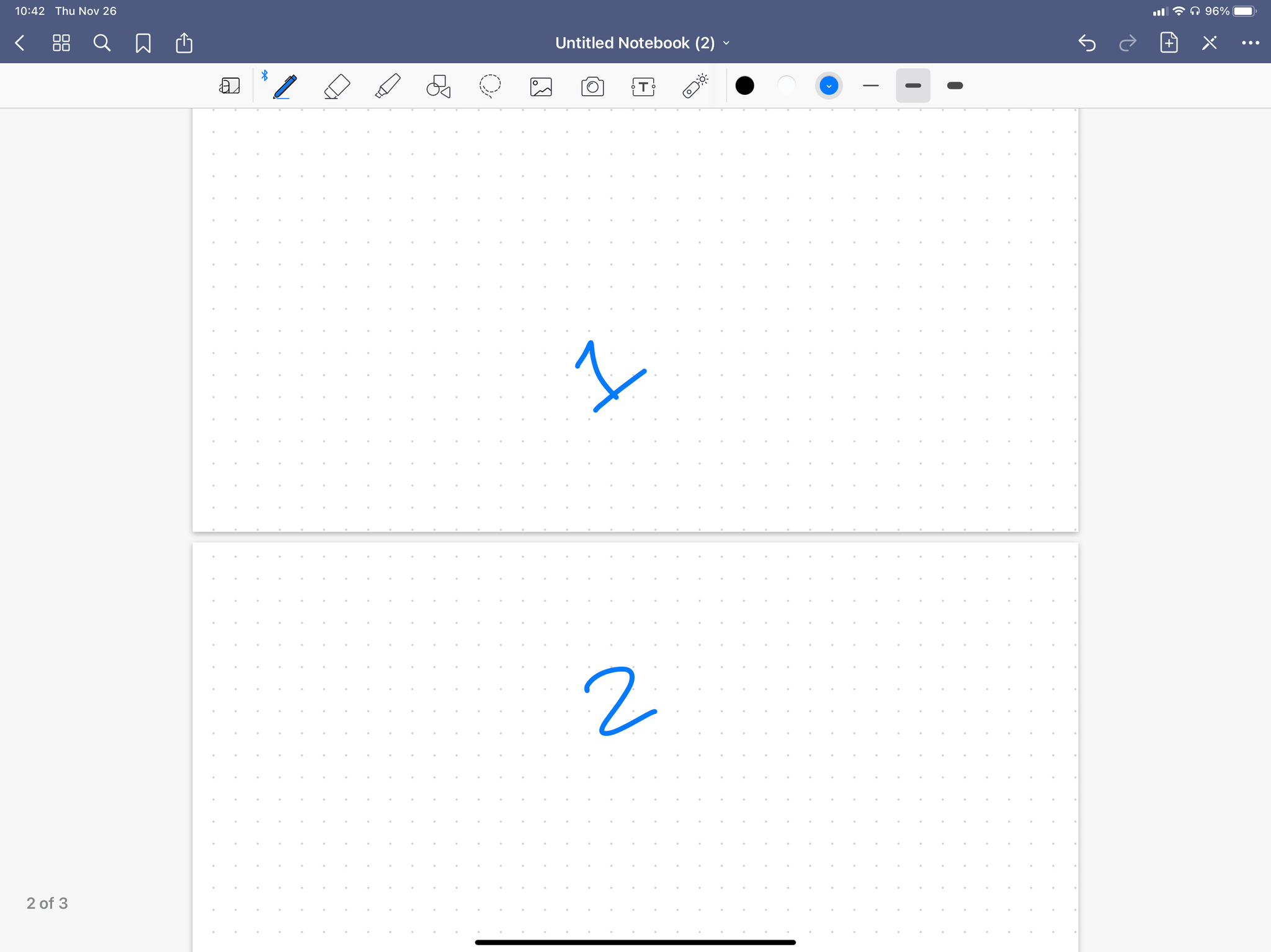
The beautifully-designed digital sketchbook GoodNotes uses a page-based model.
The ancestry of these apps trace back to paper-based counterparts. So perhaps this is just an artifact of the analog medium, needlessly carried forward into digital?
But there’s more to it than that: the page model provides structure, a sense of scale, and a way for the user to orient themselves. As a thought experiment, imagine a slide deck creator where every slide started in the center and was of potentially infinite size. A concept like “I’ll put this on the side, since it’s less important” becomes meaningless when there are no sides.
Infinite canvas in design tools
That brings us to the “infinite canvas” lineage of design tools: Illustrator, Sketch, Figma. Designers love the ability to arrange artboards spatially to show user flows or sets of design variations. But to date there are few examples of successful infinite canvas apps outside the realm of design.
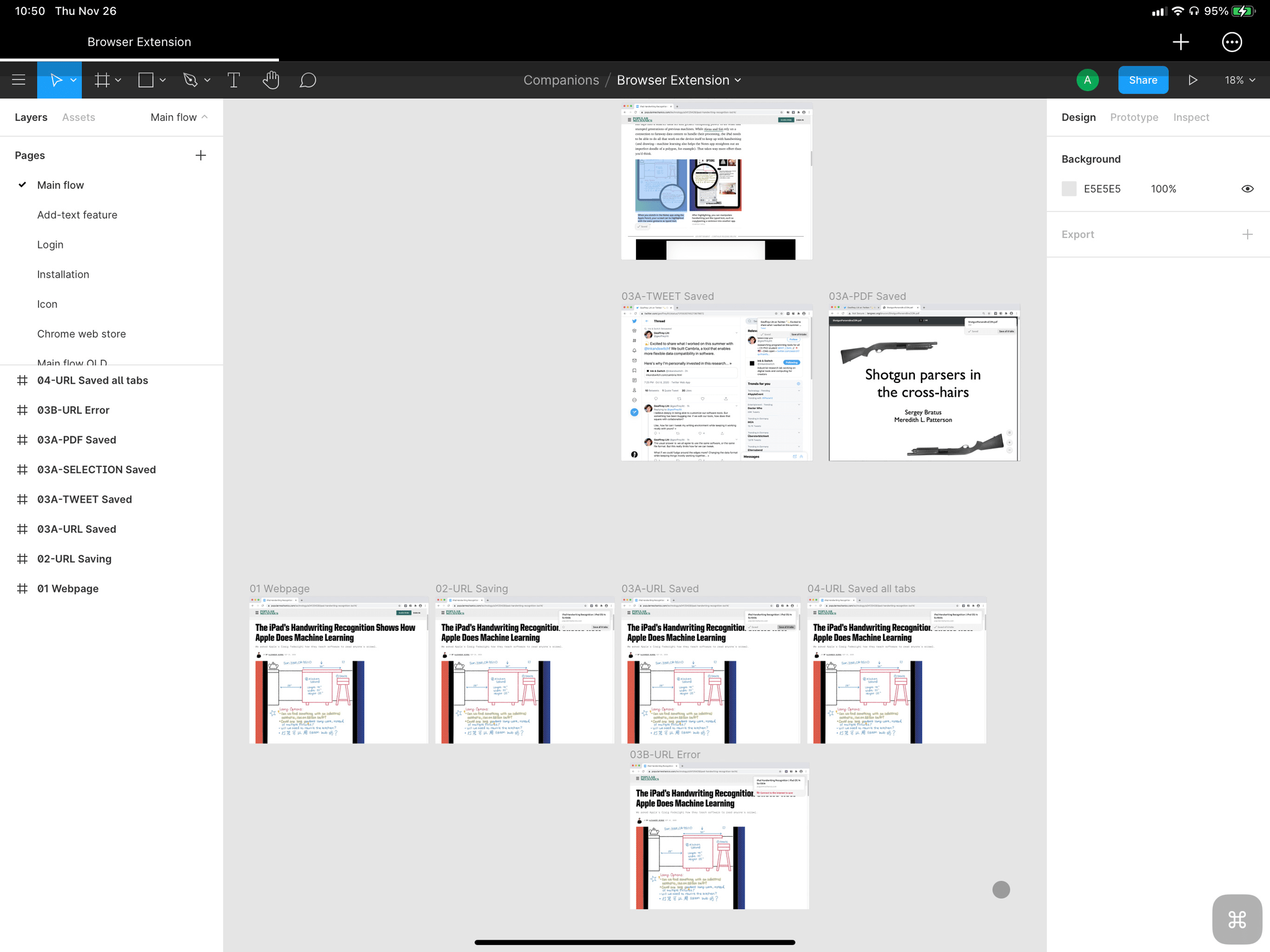
Figma is the archetype for design tools with an infinite canvas.
So why not “just” remove the boundaries, and create boards with no edges?
The ability to expand boards on one axis is how Muse works today. It’s still a page: just one you can make wider, like a spool of paper. But our experiments have shown that this starts to break down as you add more directions of freedom. The user quickly finds themselves disoriented, like floating in an endless white void. (Maybe you can find Jony Ive's white room out there somewhere!)
One solution is adding arbitrary zooming, like Figma: pull out to see the landscape, pull back in to do detail work. But this adds another layer of confusion because there is no consistent sense of scale. For example, if you can start drawing at an arbitrary zoom level, what happens with your ink thickness? And that's without working through the interface and mental-model collision of Muse's nested boards and spatial navigation.
So that's the tradeoff: the page model great for getting the user oriented and having a sense of scale and structure. Yet with Muse we’ve seen that the page model is irritating not just for those black bars in portrait mode, but also when you get to the edge of the board and just need a tad more space.
Designing a solution
The Muse team has spent the last few weeks on intensive design prototyping to explore whether we can find a better tradeoff. Is there a sweet spot that gets the best parts of an infinite canvas (feeling of spatiousness and unconstrained creation) with the best parts of the page model (feeling of groundedness and orientation)?
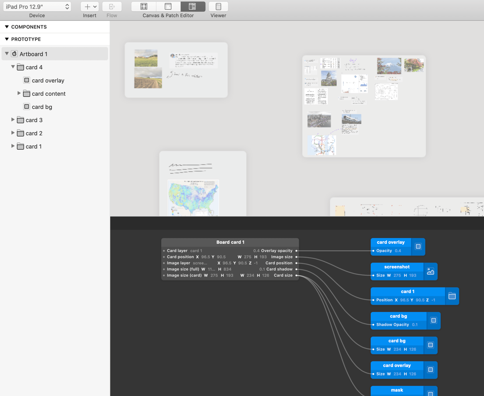
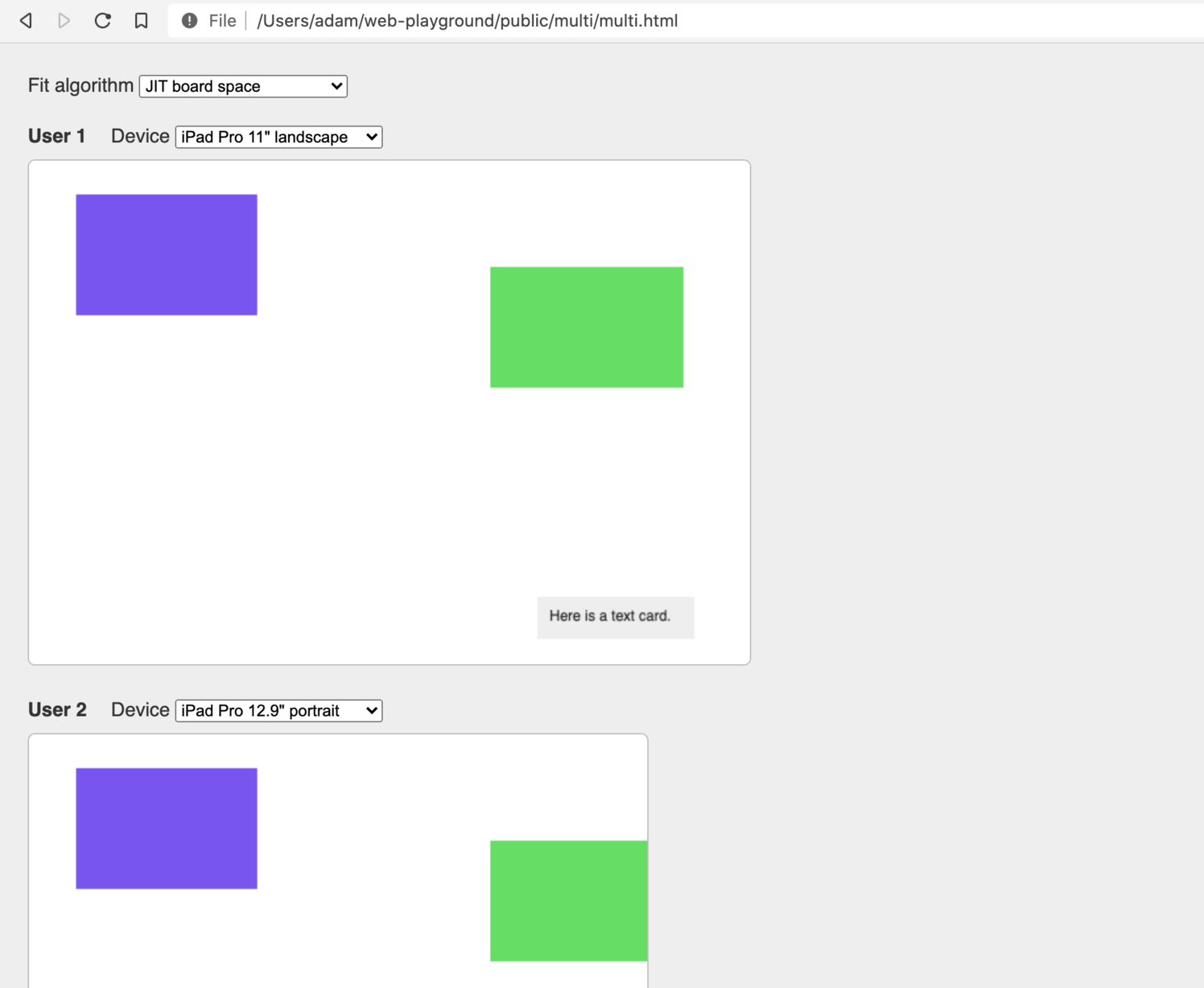
Prototypes to explore visual models. Left: Origami Studio, right: Javascript + HTML canvas.
Some choices we made based on these explorations:
- Boards are anchored in the upper-left. We found having two clear “edges” of the board is a nice way to orient, since there’s a clear starting place and then two possible directions to grow (right or down).
- Rather than explicitly adding board space, you move content (a card or ink) into empty space. The board is always the size of its content. However we also have some prototypes with more explicit edges and make-space gestures; we'll continue to play with this.
- We avoid some of the “lost in a white void” problem by preventing scrolling to completely empty space. You can't scroll over five screens worth and then drop a single dot of ink.
- Scroll bars don’t make as much sense in this setup; we’re experimenting with offscreen content indicators, inspired by open-world video games.
And here's an early look at this implemented in Muse:
Open questions
This is still early. One thing we’ve seen in testing already is that having more space on a board makes the user less inclined to create sub-boards. This is good for creation (less effort) but not as good for reading (nested exploration is more approachable than a huge two-dimensional board).
There are also big new technical challenges with these boards. In the released product, we may end up limiting the board size to manage this. So less “infinite” and more “open, two-axis expansion”—though that doesn’t quite have the same ring.
Join the beta
This is still a work-in-progress, but it’s far enough along that we’d like to get customer input. Is this an improvement over the current page-based model? That’s something only real-world use will tell.
Update: we’ve released this beta as flex boards and it's now the default for all Muse users.
