
Muse 1.5: Flex boards
Today we’re launching Muse 1.5 with flex boards, the next generation of the Muse spatial model. Create boards that are wide, tall, or extend in both directions; enjoy full support for portrait orientation; and some extra goodies, like moving ink between boards.
What’s new
Now available for all Muse users:
Create boards that are wide…
…tall…
…or both.
No more black bars in portrait orientation, or when importing Muse bundles created on different-sized iPads. Muse always uses your entire screen for board content. Portrait and landscape orientation both feel natural and native, and you can rotate freely between them.
The beta
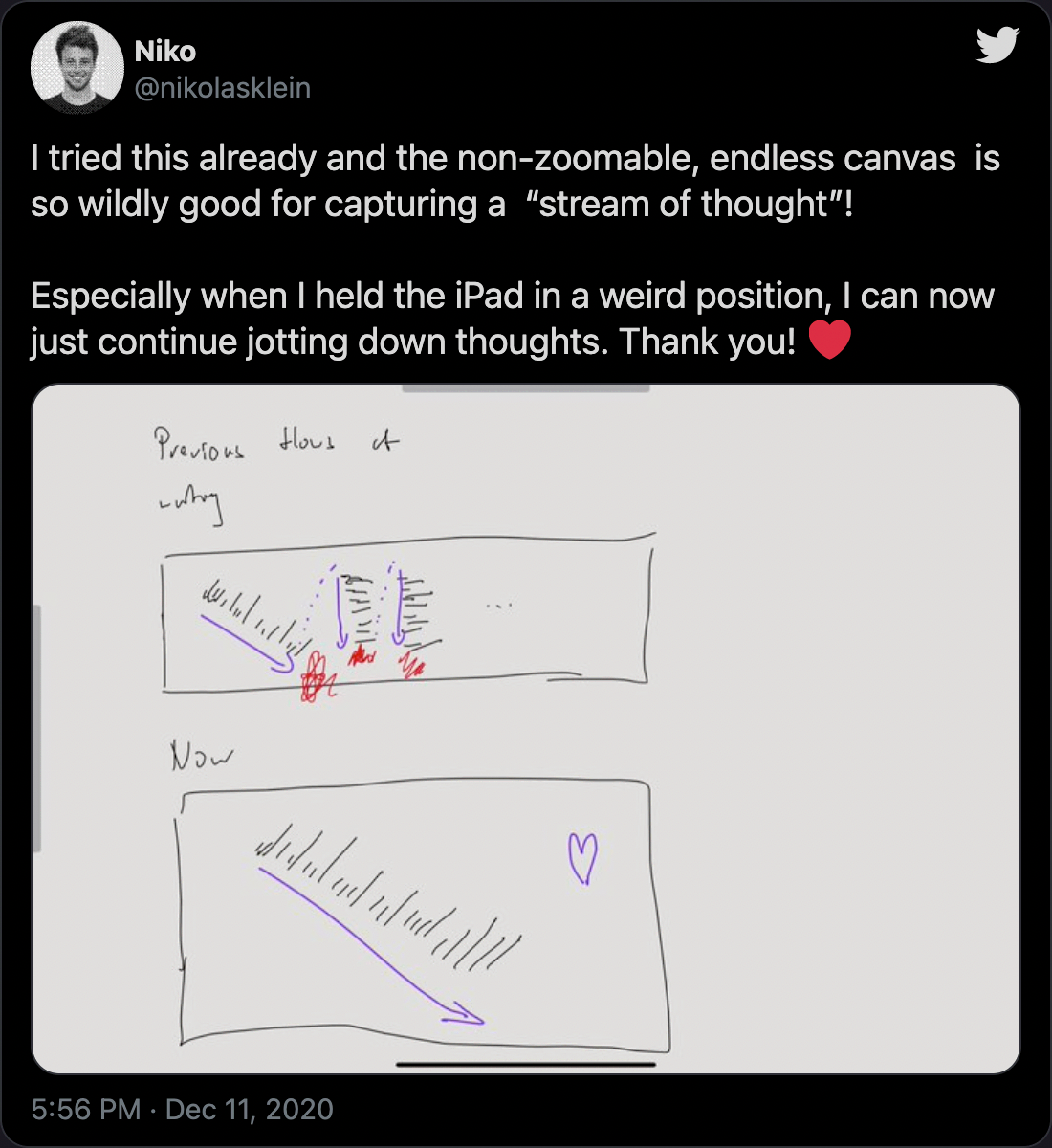
A huge thank you to the many Muse members that tried out the beta over the past few months. Your feedback on the positive aspects (feelings of spatiousness) and the negative (disorientation, “wobbly” feeling on tall and wide boards) fed directly into the decisions that went into the finished product.
Board sizes
Flex boards are designed to feel spatious and free, but in practice we found that being fully unlimited in size creates both design problems (orienting yourself on huge 2D boards) and technical problems (keeping up 120fps on huge boards). So boards are now sized as follows:
- Boards created by Muse users on the free trial can grow up to 2×2 their iPad’s size. (Boards you may have had from before will be able to keep their previous size.)
- Muse members get boards up to 10×10 their iPad’s size. In practice we think this is larger than you’ll want to make any board, but we’re curious to see what kind of boards you create with so much space available.
And: no more dead space if you expand a board and then later remove content. Flex boards take their size from the content that’s there, so to remove space from the edge simply remove whatever content is there (cards or ink).
Direction locking
A piece of frequent feedback from the beta period was that scrolling in two directions can feel “wobbly” when your board content is mostly vertical or mostly horizontal.
Flex boards infer when you have content only going in one direction and lock scrolling to only go that direction, unless you make a very deliberate pan gesture on the counter-axis. This is something we’ll be tuning more over time, so let us know how it feels for you.
What about “infinite canvas”?
The beta of this feature had another name, but for the released version we decided this isn't quite right. From a design perspective, infinite is not fully desireable—the disorientation problem we continue to grapple with. Boards that grow to unlimited also introduce technical challenges, which we might write about in another memo.
But most importantly, Muse boards are not canvases. “Board” evokes pinboard, whiteboard, corkboard, mood board—whereas canvas invokes a more artistic sense, as in painting or drawing. So we’ll leave canvases to more art-focused apps.
Your iPad, transformed
We began this project with relatively prosaic intentions: to support true portrait orientation for Muse. But through the process of receiving beta feedback from members and using it ourselves, it grew in scope and significance.
Toolbars and other “chrome” have been part of graphical computer software since the beginning. The word processor I used on the Apple II gave over half its screen space to a keyboard-driven tool palette; programs like Photoshop have a bewildering array of tool panels; and the configurable toolbars of Microsoft Word and web browsers in the 1990s are remembered with scoffing humor.
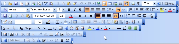
The infamous Microsoft Word toolbar.
Touchscreens continue this tradition, in some ways making the entire screen into nothing but chrome with touchable buttons and selections. For consumer apps this makes sense. For productivity tools, the majority of the screen space should go to your content: the article you’re writing, the picture you’re drawing, the PDF you’re reading. Tool chrome is in direct competition for that valuable screen real estate.
And at least on desktop computers, you have larger (often 2× – 4× bigger) screens compared to an iPad. And you have space-saving techniques like keyboard shortcuts, tooltips, and pull-down menus.
Muse was designed to be chromeless from the beginning, offering you an edge-to-edge canvas for your work. Most operations (navigate, move, resize, create new board, undo, redo, drag-and-drop, ink, erase, select) can be performed purely with gestures. The ink toolkit and action bar are low-profile and hidden by default, appearing only briefly when you wish to access them.
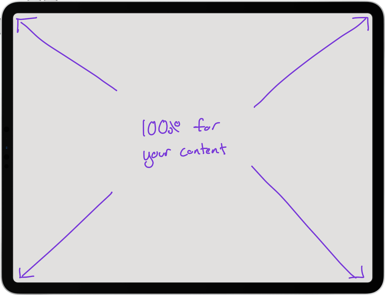
Every last pixel is for your content.
Combining the Muse chromeless interface with flex boards is a surprisingly powerful combination. It has many of the best qualities of analog thinking tools like whiteboards and sketchbooks (a calm, blank page for your work) with the best qualities of digital tools (nearly infinite space). We humbly submit that the combination of the iPad, Pencil, and Muse with flex boards makes a truly next-level tool for thought.
The future
Flex boards are a fundamental shift in the Muse product, and one that has opened up a vast new design space for us to explore and iterate on. This first release is already a big improvement on the core Muse experience, but doesn’t yet incorporate some of the ideas we’ve prototyped such as game-inspired navigation tools.
But we felt it was time to get this into your hands and find out how it changes your use of Muse for everyday work. So give it a try by downloading Muse on the App Store.