Pointing in virtual spaces
What do classroom lectures, conference talks, sales presentations, whiteboard brainstorming sessions, and team planning meetings all have in common?
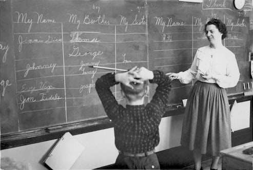
Small-scale teaching with a visual aid.
These are all examples of group attention where we gather in physical spaces and give our attention to a presenter.

Large scale on a projector, but same in concept.
The presenter uses a visual aid—like a chalkboard, a slide deck, or a kanban board— to help the group come to a shared understanding about a topic. Such gatherings are an important part of our lives as learners and makers.
Now these gatherings are migrating online, with the presenter speaking into a webcam and the visual aid offered via screenshare.
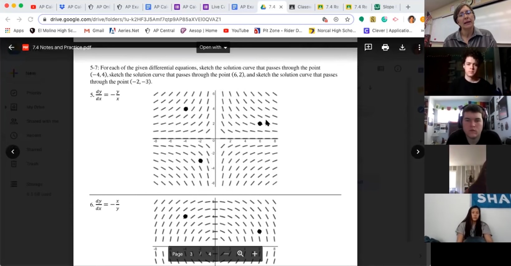
Teaching calculus over screenshare.
The convenience and accessibility of virtual meetings is a huge win. But we also lose important cues compared to in-person meetings. For example: seeing where participants are directing their attention; gesturing to indicate a participant spatially; or raising your hand to indicate a desire to take the floor.
Next-gen videochat and virtual meeting startups like Around and Gather are working to fill in some of these missing social cues. And collaborative whiteboards like Miro and the just-released FigJam use nametags on cursors for awareness of where participants are directing their attention. But we expect that traditional videochat with screenshare will be the dominant method for some time yet, so what can we do within that?
On the Muse team, we’re most interested in the visual aid piece of the equasion. And one cue that connects participants to the visual aid is the act of pointing.


When explaining a concept, the presenter (or a question-asker in the audience) uses a hand gesture to draw attention to part of the visual aid. It says “look at this spot” but can also draw attention to, for example, the shape of a plot. This can be with a finger or hand, but it’s also often with an implement like a whiteboard marker, a pointing stick, or a laser pointer.
When we come to visual aids over screenshare, most of these methods for pointing can't be used. Presenters in digital spaces thus tend to use folk practices to replace pointing such as:
- Wiggling the mouse cursor
- Selecting and deselecting text several times
What about the built-in annotation tools in screenshare? Despite being explicitly for this purpose, our observation is that these are rarely used in real life. Perhaps because screenshare is a separate layer from the visual aid itself, users are less likely to reach for the annotation tools.

Not often used, unfortunately.
An iPad feels like a natural tool to use as a digital chalkboard. And we’ve seen Muse users do this very thing by connecting their iPad to screenshare and using a board as a visual aid in a presentation, or as a shared space during a planning or brainstorming meeting.
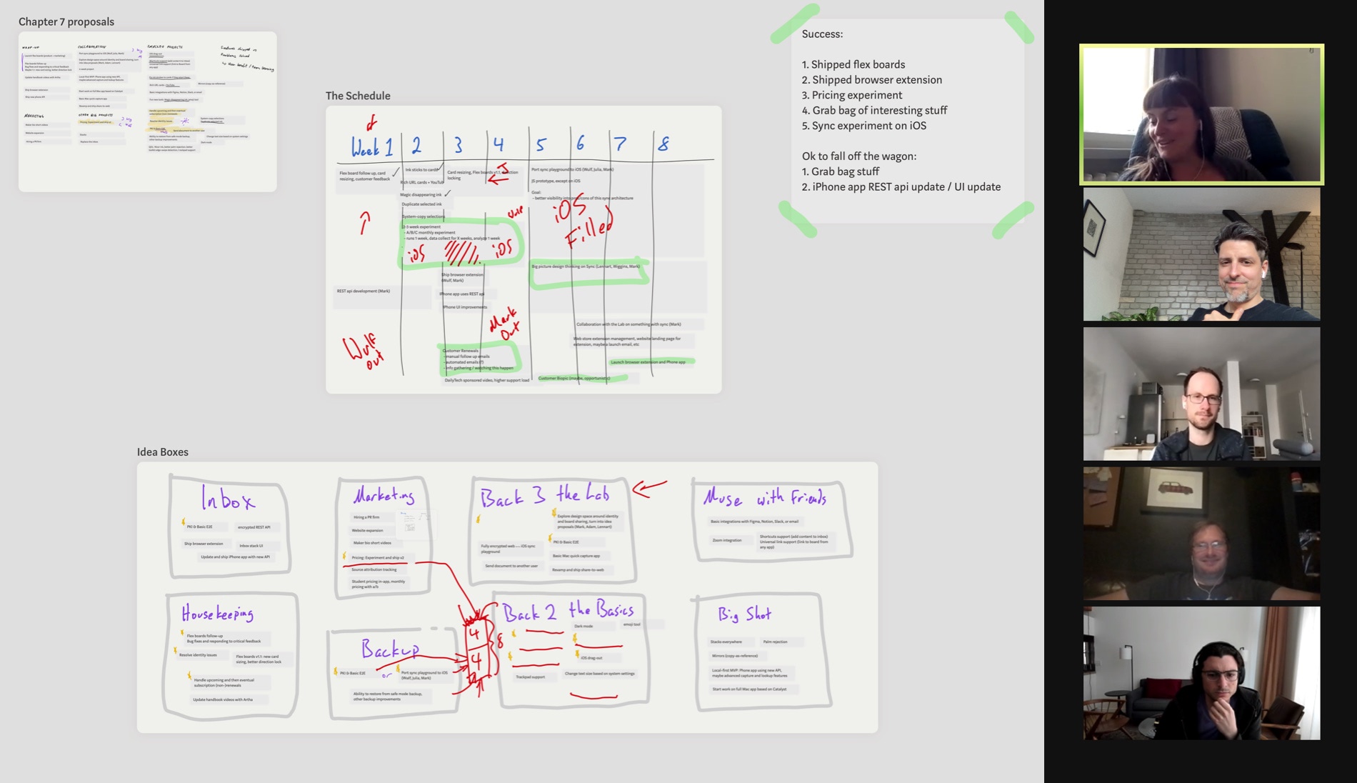
Julia from the Muse team leads a planning meeting.
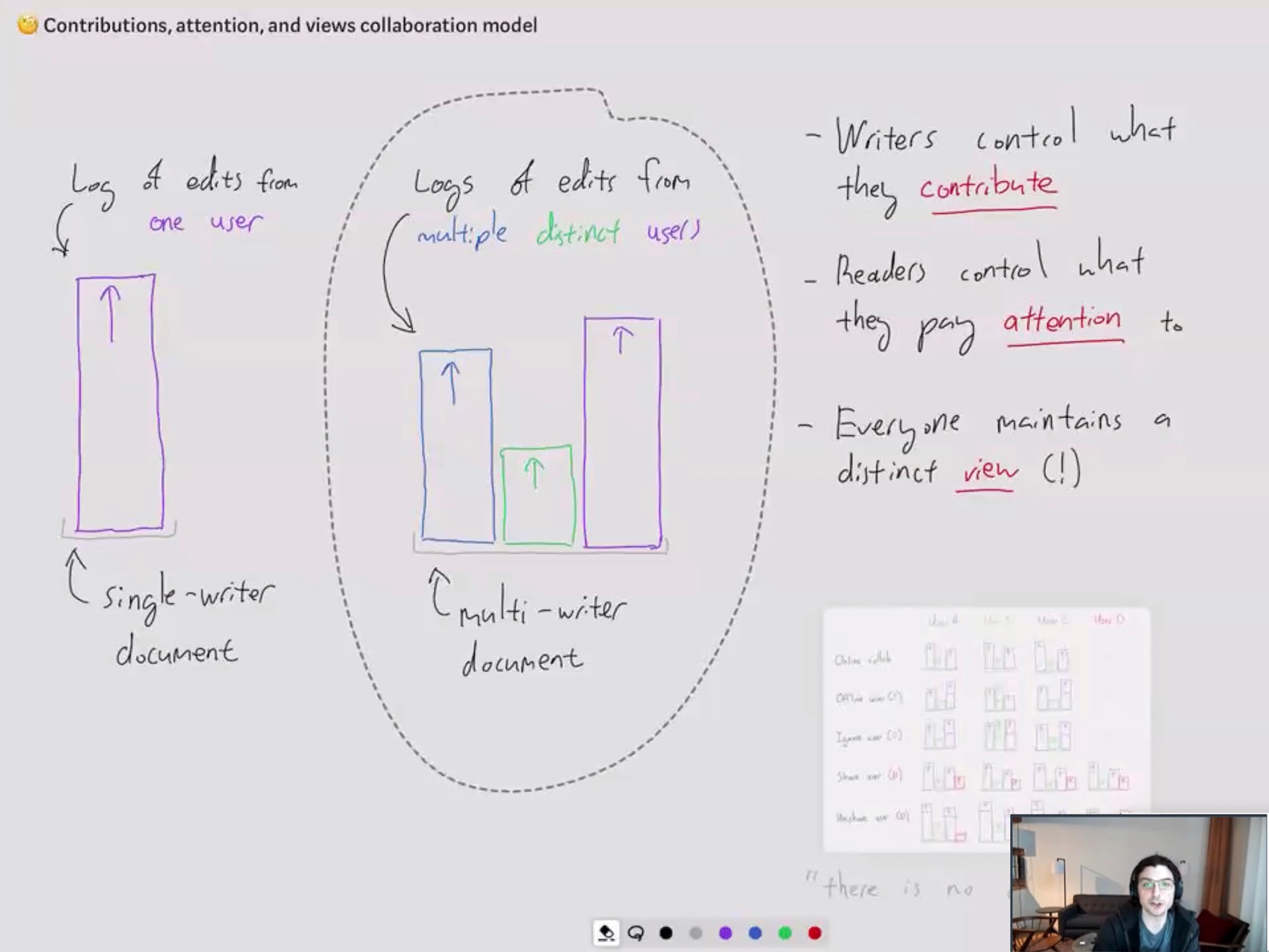
Mark from the Muse team presents on local-first syncing technology at an Ink & Switch workshop.
In the second screenshot above, Mark is using the selection tool to point to an area of his diagram—very similar to selecting text in a text editor or Google Doc to “point” to it. That led us to think we could make this behavior into a first-class Pencil tool more suited to the purpose.
So starting in Muse 1.5.6, you can customize your Pencil Toolkit with a presenter pen in two neon colors (orange and cyan) and a subtle gray.
Ink created by the presenter pen is thick and bold with a bright neon color, to aid its utility in drawing attention. Ink from the presenter pen will fade out after a few seconds. Thus it feels more safe because you can’t change anything, and can scribble all over your boards, PDFs, or images.
The neon colors are designed to draw attention for your audience; the gray color is for light temporary sketching as a thinking aid—or just for fidgeting.
We hope the presenter pen will be easier to reach for than screenshare annotation tools, because it’s part of the visual aid toolkit rather than a layer over the top. And while the presenter pen is a very small step toward Muse as an effective visual aid, we hope it points the direction of things to come.
Do you use Muse over screenshare? Tweet us or email us a screenshot.
