Toolkits
- Inking—on, around, in-between your cards—is one of the main features of Muse for iPad. From the start, Muse purposely had a limited tool loadout: a black pen, a purple marker, and a yellow highlighter.
- Too much customization of pens can lead to fussing with tools instead of sketching. Exploring ideas through sketching is all about keeping the right level of fidelity.
- Many inking-capable apps offer detailed controls for configuring ink such as type, color, and width. But we find this adds unnecessary bulk to your everyday interface and encourages you to be constantly fussing with your tools. And if you're not using a particular tool (say, a highlighter), you're forced to look at it constantly.
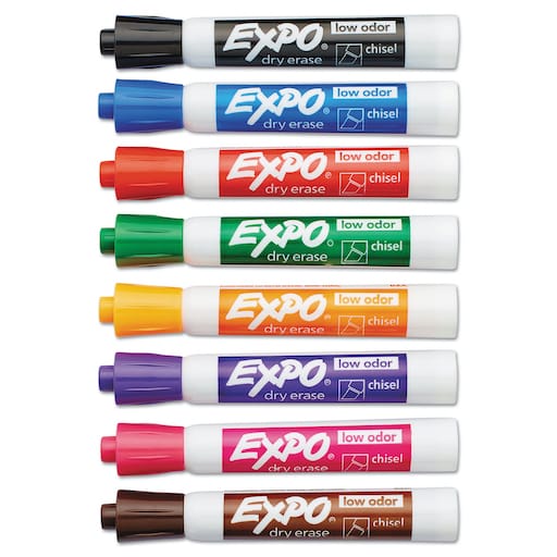
- For inspiration, we looked at drawing tools work in the physical world. For a given setting—like a desk or whiteboard—you probably have a small, specifically chosen set of tools at hand. This keeps your workspace clean and switching among tools is unobtrusive and fast.
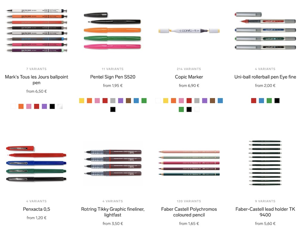
- Each project, workspace, and creative person is different. You can go to an art supply store with walls full of options and pick your favorites. But you wouldn't want to look at all these choices constantly during your project!
- You might also have some tools besides inks. An architect might use a ruler, for example.
- In digital tools, we like how Concepts applied this idea of customized tools configured into a clean toolkit.
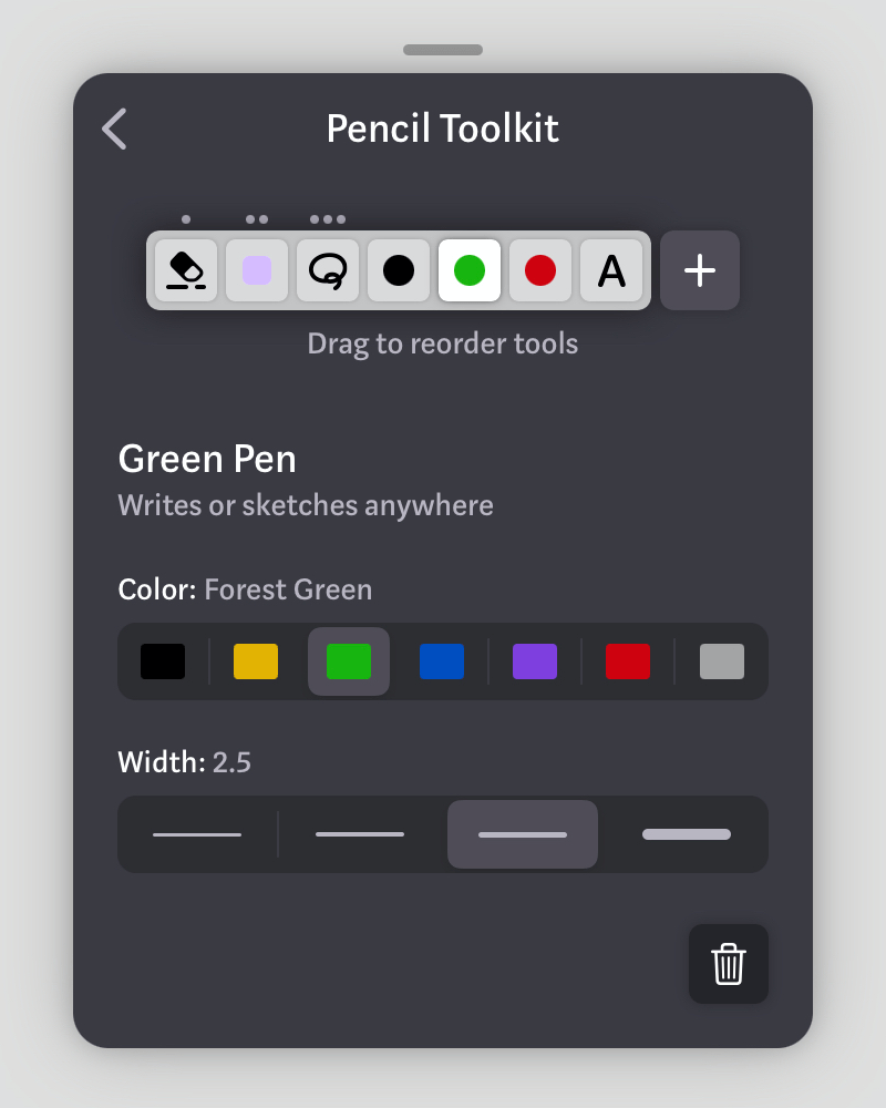
- Muse still has its swipe-in toolkit. But now: configure it to your liking via Settings → Pencil Toolkit.
- Importantly, you can scribble with your toolkit as you’re setting it up on your live board. Like those little test papers at art supply stores.
- What about color palette?
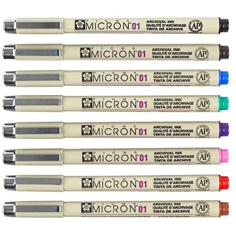
- Our research across domains showed that seven or eight colors is common. This is the number of distinct colors you can have before needing gradations within a logical color (e.g. light blue vs. dark blue). It's also rarely useful to have more than a handful of colors in a single document.
- Similarly for ink width, there's a balance between being able to customize and the options becoming uselessly close to each other. For technical pens this has traditionally been about √2 increase in width between pen sizes.
- Note that there are now three non-ink tools in the toolkit: eraser, selection, and Scribble. More are coming in the future.
- Whatever tool you put into the first, second, and third slots are activated by a one-finger down, two-finger down, and three-finger down quasimode. So you can put other tools there for quick access, and move the ones you use less out of the way.
- And oh yeah, that means there's now a three-finger down quasimode!
- Combine all these design choices together and you get the Muse toolkit.
- Customize the exact right set you need for your project, then hide away all those options to focus on your work and switch quickly between your active set of tools.
- We're excited about this design and would love to hear what you think.
Muse 1.3 is now available including a brand new customizable toolkit. We hope this will give you the flexibility to customize your pens and other tools to your taste, while maintaining the elegant Muse interface you’re used to.


